Images make up a large portion of a webpage’s payload. According to the HTTP Archive, the average image size has grown almost twofold and now constitute a whopping 63% of total bytes of a webpage. This growth in images on the web has coincided with faster network speeds and growing bandwidth; meaning that loading webpages today has never been faster— for some of us. High network latencies and low bandwidth (mostly over mobile connections) is unfortunately commonplace for a large percentage of the world. This means incredibly slow webpage load times and an increasingly frustrating experience browsing webpages. While doing away with images altogether would theoretically solve the problem of slow page load—removing all images from the top 1,000 websites, these sites would load 30% faster on average over 3G (high performance images)—a text only webpage would significantly hamper user engagement. Thankfully, there are many tricks to optimizing images for the web so we don’t have to skimp on the overall design and user experience of a webpage.
File Formats
When considering strategies to optimize your images, you have to strike a balance between low file size and reasonable image quality. A low quality image may have a small file size, but it may not be useful for engagement compared to a higher quality image of larger file size. Choosing the right image format plays a key role in ensuring your images are optimized for performance.
There are 3 common file formats supported by the web; JPEG, PNG and GIF. Of the 3, JPG is the most popular image file type on the web. Because JPG has a huge color pallet, it is the de-facto format for digital photos and any complex image that requires color, shadow, and/or gradients. It can also be saved in a varied range of qualities, from high to low thereby making it easy to optimize without much added thought or effort. PNG is also another popular image file type after JPG. Compared to the former however, PNGs can handle transparency and produce higher quality images. GIF is probably the oldest image file type, originating in 1987 as one of the first portable, non proprietary image formats. Because GIFs originated back when network capacity and computing power was limited, they are great for animated images and small sized images but not so much for high resolution images.
Tips and Tricks
Now that we’ve covered basic file formats, let’s look at some techniques you can use to further optimize your images.
Srcset
The srcset attribute available via the <img> tag took the web development world by storm back in the early days of Responsive Web Design. The idea behind this was to switch between different versions of the same image depending on many factors including the user’s device viewport and network connection. By using srcset and its corollary size attribute, you provide the browser with information that it can then use to determine the best image to present to a user based on the current context. The nice thing about srcset is that, the browser does the heavy lifting when it comes to loading the right image to the user. All we have to do is provide it with the various formats from which it can choose from. For a quick primer on using srcset, check out this timeless article by Chris Coyier on CSS Tricks.
JPG +PNG to SVG Mask As we mentioned earlier, the strength of PNGs lie in their ability to handle transparency while that of JPGs lie in their relatively smaller file size. Combining both file formats and converting the composite into an SVG mask allows you to leverage the strengths of both without compromising on file size. This is achieved thanks to the compositing capabilities of SVG. Here’s a quick look at what that looks like in code:
<svg viewbox="0 0 560 1388">
  <defs>
    <mask>
      <image width="560" height="1388" xlink:href="can-top-alpha.png"></image>
    </mask>
    <image
      mask="url(#canTopMask)" id="canTop" width="560" height="1388"
      xlink:href="can-top.jpg"
    </image>
  </defs>
</svg>
To try this out for yourself and get started, check out this demo inspired by this blogpost.
Contrast Swap Technique The contrast swap technique by Una Kravets is a nifty technique to leverage modern CSS to help lighten the load of images. The concept is fairly straightforward. You start with your image, remove any contrast via photoshop or your favorite photo editor, then reapply contrast via CSS filters. Applying this technique to your images reduces image size by over 28%. For more on this, check out [Una Kravet’s post on CSS tricks](http://In each of the above cases, we saved between 23% and 28% in image size by reducing and reapplying the contrast using CSS filters. This is with saving each of the images at maximum quality.).
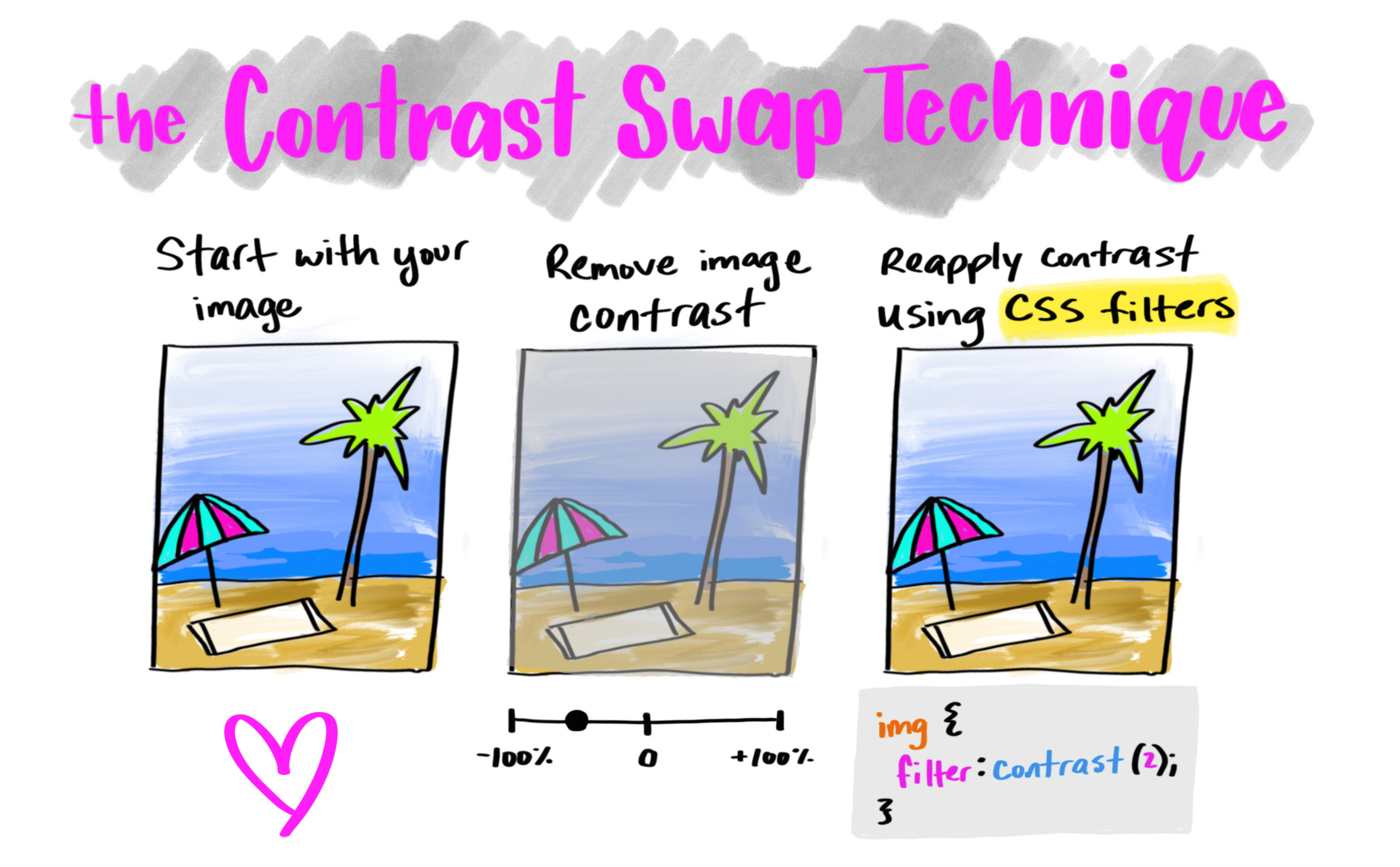
Image Compression An easy way to enable your images stay small is to run them through a compression algorithm. Compressing your images save on image size by removing hidden data such as color profiles, and geolocation from the image file. Tools such as Google’s squoosh.app, are great tools by which you can start compressing your images to maximize on performance.
Lazy Loading A large number of images loaded by a webpage are never actually seen by the user. Loading every single image on a webpage therefore only wastes bandwidth and unnecessarily slows down your load time. Lazy loading is a technique that defers loading non-critical or off-screen resources at page load time. In theory the idea of lazily loading an image are trivial—you want to make sure you have some placeholder content while waiting on the image to load to prevent content jumping— but the implementation details can be tricky. This is because there are many ways of lazy loading an image, all of which require some amount of JavaScript. Chris Coyier’s solution to lazy loading is a good starting point when considering this as a solution to more performant images.
Resize your images Another trick to reducing file size is by simply resizing your images. According to research done by Colin Bendell, author of High Performance Images, increasing image width, nearly doubles byte size (a 600px image weighs in at 33.9kb, while a 800px weighs a whopping 74.7kb). When adding images to your webpage therefore its worth considering how much the size of your images matter to overall user experience.
Optimize but never compromise
As with most things, there is no one size fits all solution to optimizing your images online. However, finding the best image optimization strategy puts us on the path to more performant webpages.